 Guy Kawasaki’s The Art of the Start, addresses a number of valuable startup issues, including fundraising, partnering, branding and beyond. In addition to these foundational startup issues, Guy also briefly discusses how to properly design a corporate T-shirt.
When I evaluated Guy’s book for its potential use in my UCSB entrepreneurial classes, I was impressed overall, but I thought his comments on T-shirt designs were gratuitous. My initial thought was, “Guy, are you really telling me how to design a corporate T-shirt?”
Then I took a moment to consider a couple T-shirts we developed at Expertcity (creator of GoToMyPC and GoToMeeting, acquired by Citrix). Upon reflection, I realized that we would have been well served if we had applied Guy’s T-shirt suggestions.
If you haven't already subscribed yet, subscribe now for free weekly Infochachkie articles!
Need Help? Click Here
As described in Lousy Product Names, Expertcity was initially a marketplace for services in which users utilized our technology to solve technical support issues. In our attempt to make this flawed business model successful, we partnered with Sun Microsystems. They licensed our screen sharing technology to support their StarOffice customers.
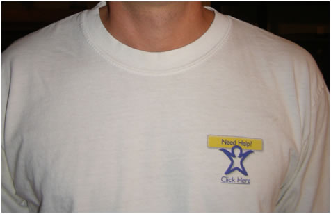
As part of the launch of this new service, we collaborated with Sun to design a T-shirt. The logo that was displayed on the shirt is show below. In isolation, it appears fairly innocuous. Our message was, “If you need help, all you have to do is click.”

In those days, I derived as much value from Expertcity’s SWAG as I did from my meager paycheck. When I came home wearing the Sun Microsystem T-shirt, with an extra one for my wife, she took one look at it and responded, “I would never wear that.” I was shocked, as she generally welcomed a chance to promote Expertcity. However, her reaction was clear when she poked me, literally “clicking” on the logo.
Getting “clicked” on the nipple is not welcomed by most people, especially women. However, before you become indignant at the insensitivity of the men who undoubtedly designed this shirt, take a breath. It was actually designed by two women, a VP at Expertcity and a VP at Sun.

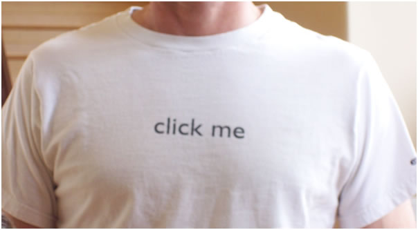
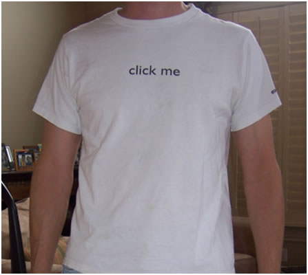
One terrible T-shirt design should be enough for any startup, but we managed to come up with two. To promote the Expertcity marketplace, we created the following design.

Seen up close, the text is not particularly compelling, nor is it particularly offensive. However, when seen from afar, the message changes considerably.

If you do not see anything other than “click me” in the above photo, ask a friend.
Not only is this shirt offensive, it breaks most of Kawasaki’s rules of T-shirt design, which are summarized as follows:
Do Not Use White – It quickly becomes dingy, reducing its life. We, of course, used white.
Minimize Text – We did adhere to this suggestion, although our execution was abysmal.
Use At Least A 60-Point Font – We blew it here. Our tiny font contributed to the potential misinterpretation of our messaging.
Spend Some Money On Design – Epic fail here as well. We did everything in-house.
Make Kid Sizes – Thank goodness we did not adhere to this rule, as we might have been arrested for child endangerment.
List Source: Guy Kawasaki, The Art Of The Start
Satisfied Students
I have used Guy’s clever book in my New Venture Creation class for the past five years, sharing it with thousands of students. Categorically, they find the book to be extremely additive to their entrepreneurial education. My hope is that they learn from Guy’s thoughtful discussions of numerous entrepreneurial issues, including branding, promotion, product development AND T-shirt designs.


